Hello I am Sophie Munro, an AS Media Student at Samuel ward Arts and Technology Academy.
At the begining of the year i chose to do film Analysis instead of Texual Analysis with three of my best friends, Teresa Munsterkotter, Keri Meadows, and Kelly Alexander.
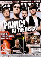
 Kerrange, a popular music magazine for a more masculin audience. The main focus is on my favour band, Panic! At The disco. Kerrange is more appealing to me then the Vogue magazine. The name of the magazine os hidden behind the band, just like how Vogue is hidden behind there main image. The band name is in huge font, grabbing the attention of the readers. The name of the magzine itself has its own image, shattered like glass. There is a footer at the bottom of the image and even images of more bangs like Paramore and Metalica. Any metal, punk, or emo music loving fans would love this magazine as it even has posters of live shots (shots taken while at one of there concerts)
At the begining of the year i chose to do film Analysis instead of Texual Analysis with three of my best friends, Teresa Munsterkotter, Keri Meadows, and Kelly Alexander.
What’s the difference? Film media involves analysing film clips, breaking them down into their micro elements and discussing what effects they have based on what the film is representing (Age, Gender, Sexuality, Regional identity, Disability, Race)
The genre for are media film is Supernatural Thriller. Sounds easy doesnt it?
The amount of effot and thinking means that this project was no easy task and took truck loads of hours to prepare
Print media involves analysing magazines, newspaper’s ect,, to break it down into its own elements E.G: Header, footer, Tag line. And to discuss how the text aimed at a certain target audience. This is what i produced for a print media peice.
This is the final outcome of my print media work.It is a magazine cover for teenaged girls. The name of the magazine is in the largest font and points out the gender group for the mag. Right under the title is the tag line, "Girlie-Gossip-Glam". A small symbol which is a crown draws eyes to the tag line and the name. Main header is a quoat from someone about gossip, and since girls love to gossip and read about other peoples relationships this header should be irrisistable. The exclusive is there to again try to convince the target audience to buy the magazine: "David Becham in the buff?" A famous footballer with muscles is all to iresistable.
The striking yellow stars are to illuminate tempting offers like the "Win a grand" and "picture perfect posters" of Juston Beiber and Lady GaGa. The love heart is another of the girly sybols i wanted to add to the page and was also added to add another artical about true stories like "my mum had sex with my boyfriend!" Shocking right? it makes you want to read the magazene to find out the whole story.
One thing girls love more then the latest gossip is cloths, shoes and make up. So i added this small text box to the bottom right indicate about the latest Fashions.
Vogue, aimed at good looking women with lots of money to spend on the latest vashion. Look at the main picture, the focus of the magazine is a sexy woman in a nice dress. The colour sceme is red, the red dress, red lipstick and red curtains. Red conotes love and lust, but also makes soemone look vibrant and sexy since its such a high value colour. On this magazine there is only a colour sceme of two colours, red and white. The red makes the white stand out even more
 Kerrange, a popular music magazine for a more masculin audience. The main focus is on my favour band, Panic! At The disco. Kerrange is more appealing to me then the Vogue magazine. The name of the magazine os hidden behind the band, just like how Vogue is hidden behind there main image. The band name is in huge font, grabbing the attention of the readers. The name of the magzine itself has its own image, shattered like glass. There is a footer at the bottom of the image and even images of more bangs like Paramore and Metalica. Any metal, punk, or emo music loving fans would love this magazine as it even has posters of live shots (shots taken while at one of there concerts)
Now for film Media it isnt as easy as studying magazine covers. We have had to watch many clips and break them down in order to talk about there elements. Watching clips from programs we had to discuss everything we see and explain what the clips were representing, for instance Age, Gender, Race, Disability and Social economic groups.


No comments:
Post a Comment